Tirolcom provides integrated telecommunications and fiber-optic installation services; the logo redesign project arose from the need to refresh the company’s visual identity while maintaining a strong connection to its history. The redesign features a clean, minimalist design that conveys reliability, adaptability, and modernity.
Graphically more coordinated.
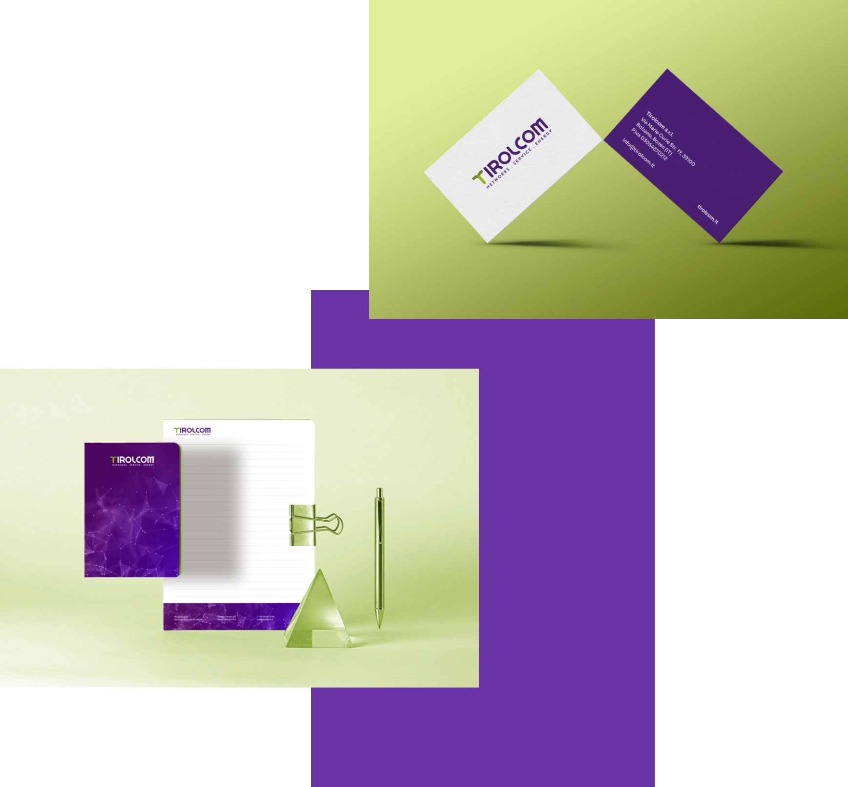
Following the logo redesign, a comprehensive corporate identity system was also developed to reflect Tirolcom’s new visual identity.
The project is based on a precise, minimalist graphic style that aligns with the new brand elements.
Typography and colors were carefully selected to be consistent, recognizable, and clear, highlighting elements inherited from the historic logo and reinterpreting them in a contemporary style.
A more evolved identity.
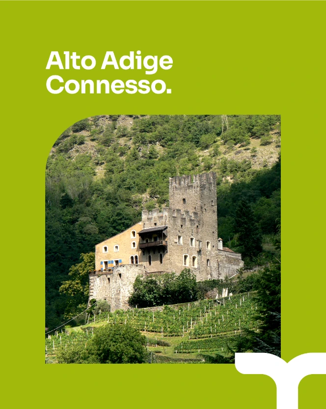
The corporate brochure serves as a clear and effective communication tool: a sleek visual narrative, supported by a balanced graphic layout, that complements the company’s content by highlighting the brand’s values, services, and adaptability. Every element is designed to reinforce Tirolcom’s identity and ensure consistent, professional, and easily recognizable communication.
More social than ever.
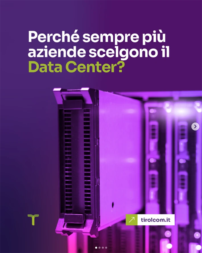
For Tirolcom, we also handled the development of visual graphics and the management of social media channels, creating a visual identity that aligns with the brand’s new identity.
This ongoing project combines design, strategy, and content, with the goal of strengthening the company’s online presence and highlighting its messages through a recognizable, simple and impactful style.
A site more linked than ever.
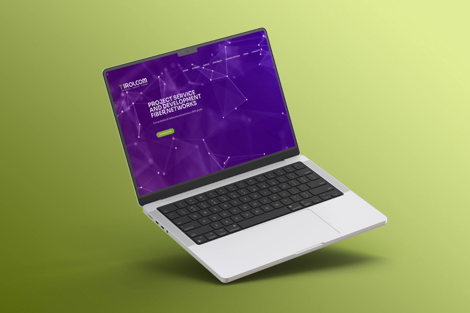
Finally, we designed and built the Tirolcom corporate website, developing a user-friendly, modern, and intuitive interface that aligns with the brand’s new visual identity.
The project was designed to ensure functionality, readability, and graphic consistency, highlighting the content and facilitating navigation across all devices. The simple, minimalist design translates the company’s values into a pleasant digital experience, strengthening Tirolcom’s online presence and brand recognition.